
A new hire opens a slide template, needs to write a headline, and has no idea whether your brand says “customers” or “clients,” whether it uses exclamation points, or which blue is the right blue. So they guess. The next person guesses differently. Six months later your brand looks and sounds like it was made by twelve people who never met, because it was. This is the problem brand guidelines exist to solve, and it is why the test of a good document is not how beautiful it looks but how reliably it answers the questions people actually have when they are about to make something. Most brand guidelines fail this test completely. They are gorgeous PDFs full of mood boards and mission statements that resolve none of the decisions a real person faces at the moment of creating.
If you want to create brand guidelines that get used instead of admired and forgotten, you have to reframe the document entirely. It is not a celebration of your brand. It is a reference manual for settling arguments, and every page that does not settle a real, recurring argument is dead weight. That reframe changes what goes in, what stays out, and how you organize the whole thing.
Guidelines are for settling arguments
The purpose of brand guidelines is to make decisions in advance so that people do not have to remake them, badly and inconsistently, every time. This is the Decision Document test: for every element you consider including, ask whether it settles a disagreement that actually comes up. The logo clear-space rule settles an argument designers have. The voice principle settles an argument writers have. The mission statement, lovely as it is, settles no production argument, which is why it belongs in your strategy deck, not in the document people open when they are about to write a tweet.
This test ruthlessly clarifies what to include. When you create brand guidelines around the arguments your team actually has, the document gets shorter and far more useful, because every section earns its place by resolving something. The bloated brand manuals that nobody opens are bloated precisely because they include everything that feels brand-related rather than everything that settles a decision. A person reaching for guidelines is reaching for an answer, fast, and a document that buries the answer under aspirational content trains people to stop reaching. Build the document to answer, and people will use it; build it to impress, and they will admire it once and never open it again.
The 10 decisions worth documenting
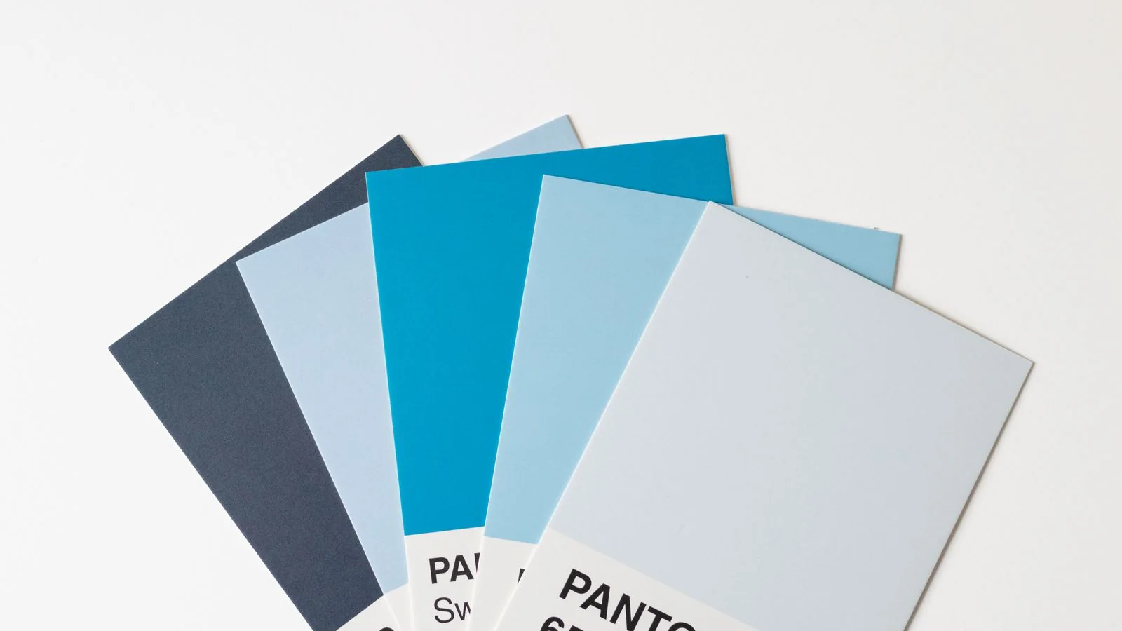
Most brands need to settle roughly ten recurring decisions, and a document that nails these ten is worth more than a hundred-page manual. The visual decisions are the obvious ones: which exact colors with their codes, which fonts in which sizes and weights, how the logo is used and the space it needs, and what imagery style fits and what does not. These four settle the bulk of design arguments, and stating them as specific rules (“this hex code, never an approximation”) is what makes them usable.
The verbal decisions are the ones brands most often skip and most need. Decide your voice in concrete terms, the words you use and the words you ban, your stance on formality, and how you handle the small recurring choices (the customers-versus-clients question, the Oxford comma, the exclamation point policy). Then the structural decisions: how the brand shows up across the specific contexts you actually use, from social posts to email signatures to slide decks. Ten well-chosen decisions, each stated as a clear rule with an example of right and wrong, cover the situations that generate ninety percent of inconsistency. When you create brand guidelines, resist the urge to document the eleventh through fiftieth decisions that almost never come up; they add length and dilute the ones that matter.
Lock the voice, not just the logo
Brand guidelines overwhelmingly over-invest in the visual and under-invest in the verbal, which is backwards, because most of what your audience encounters is words. People read your emails, your posts, your product copy, and your support replies far more than they study your logo, yet the typical guidelines document spends twenty pages on visual identity and half a page on voice. The result is brands that look perfectly consistent and sound like a different person every time, which is its own kind of incoherence.

Locking the voice means defining it concretely enough that two different writers produce copy that sounds like the same brand. Vague voice guidance (“friendly but professional”) settles nothing, because everyone interprets it differently, which means it fails the Decision Document test. Useful voice guidance is specific: the actual words and phrases you use, the ones you avoid, real before-and-after examples of off-brand copy rewritten on-brand, and the recurring micro-decisions spelled out. When you create brand guidelines, treat the voice section as the hardest and most valuable work, because it governs the medium your audience experiences most. A brand with a locked voice and a loose logo is more coherent than the reverse.
Make the rules findable or they die
A brand guideline that cannot be found at the moment of need does not exist, functionally. The most common failure mode is a beautiful document saved somewhere nobody remembers, in a format nobody can search, that a busy person will not hunt for when they are thirty seconds from posting. Findability is not a nice-to-have; it is the difference between guidelines that shape the brand and guidelines that decorate a shared drive.
The fix is to put the rules where the work happens and make them searchable. Guidelines embedded in the templates people actually use, accessible in seconds, and organized so the answer to a specific question is fast to locate, get used. A PDF buried three folders deep does not. When you create brand guidelines, design for the moment of need: someone about to make something, in a hurry, who needs one specific answer. If getting that answer takes longer than guessing, they will guess, and the document has failed regardless of how thorough it is. Optimize for the speed of retrieval, not the impressiveness of the artifact.
Show the wrong way, not just the right
Guidelines that show only the correct version teach less than guidelines that show the correct version next to the wrong one. People learn a rule fastest by seeing the contrast: this headline is on-brand, this one is not, and here is why. A single approved example leaves room for interpretation, and interpretation is exactly what produces drift. A right-and-wrong pair closes that room, because it shows not just the target but the boundary, and boundaries are what people actually need when they are unsure whether their work crosses a line.
This applies to every kind of rule, visual and verbal. Show the logo used correctly and the three most common ways people misuse it. Show on-brand copy and the off-brand copy it replaced, annotated with what changed. The wrong examples are often more instructive than the right ones, because they name the specific mistakes your team actually makes, which means they pre-empt the errors before they happen. When you create brand guidelines with paired examples, you are not just describing the standard; you are training judgment, so that people can extend the rules to situations the document never explicitly covered. That transferable judgment is the real goal, and it comes from contrast, not from a gallery of correct examples alone.
Give every rule a reason
A rule without a reason gets broken the moment it becomes inconvenient, because people only follow rules they understand the purpose of. “Always use this blue” is a rule someone will override when they think they have a better idea; “always use this blue because it is the one color legally protected as part of our trademark and consistency is what makes it defensible” is a rule that survives, because the person now understands what breaking it costs. Reasons convert compliance from obedience into agreement, and agreement is far more durable, especially in an organization where you cannot personally police every decision.
Reasons also help people apply the spirit of a rule to situations it does not literally address. When someone understands why the brand avoids exclamation points, that the brand’s authority comes from calm confidence rather than enthusiasm, they can make the right call in a context the guidelines never anticipated. A rule memorized without its reason cannot transfer; a rule understood through its reason transfers everywhere. When you create brand guidelines, attach the why to each significant rule, briefly, and you build a document that shapes decisions you will never see rather than one that only governs the cases you happened to list. The reasons are what let the brand stay coherent as it grows beyond the people who wrote the rules.
Reasons also make the guidelines defensible when someone pushes back, which someone always will. A new executive, a confident designer, or an outside agency will eventually challenge a rule, and “because the document says so” loses that argument every time. “Because this is the decision we made for these specific reasons, and here is what changes if we break it” wins it, or at least forces the challenge to engage with the actual tradeoff rather than treating the rule as arbitrary. When you create brand guidelines with the reasoning attached, you are not just teaching the team; you are arming whoever has to defend the brand’s consistency against the steady pressure to make exceptions. Brands erode one reasonable-sounding exception at a time, and documented reasons are what let the people protecting the brand hold the line.
Update the document or retire it
Brand guidelines decay, because brands evolve and documents do not unless someone maintains them. A guideline that no longer matches how the brand actually operates is worse than no guideline, because it sends people confidently in the wrong direction, and they trust it precisely because it is the official document. The stale brand manual that still references the old logo or the discontinued color is actively producing inconsistency while appearing to prevent it.
The discipline is to treat the document as a living tool with an owner and a review cycle, not a one-time deliverable you finish and frame. Assign someone responsibility for keeping it current, revisit it when the brand changes, and prune rules that no longer apply. A guideline document that is reviewed and trusted to be current gets used with confidence; one that people suspect is out of date gets ignored, which returns you to the guess-and-diverge problem you built it to solve. When you create brand guidelines, plan from the start for how they will be maintained, because the version that ships is never the version that matters most. The version that matters is the one still accurate two years from now, and that one only exists if someone keeps it alive.